Socialive Rebrand

Socialive is the leading enterprise video content creation platform. We help companies like Pfizer, Walmart, Politico, and Audible capture, create and distribute video content across all their platforms. About two months into my tenure at Socialive, I floated the idea of a rebrand and before I knew it we were off and running. Over the course of six months, the brand team (consisting of myself, the content marketing manager, the director of marketing, and the head of operations) worked to build a brand to bring life to the company and usher us into the top spot in the enterprise video creation arena.

TLDR: “Hey boss, I know I’ve only been here a few weeks, but let’s rebrand.” “Sounds good, go for it.”


original website

Items needed: Market Research, Logo, Color Palette, Fonts, Iconography, Image Treatment, Graphic Elements, Updated Messaging and Tone, Tagline, Brand Positioning, Website

The beginning

Background Research

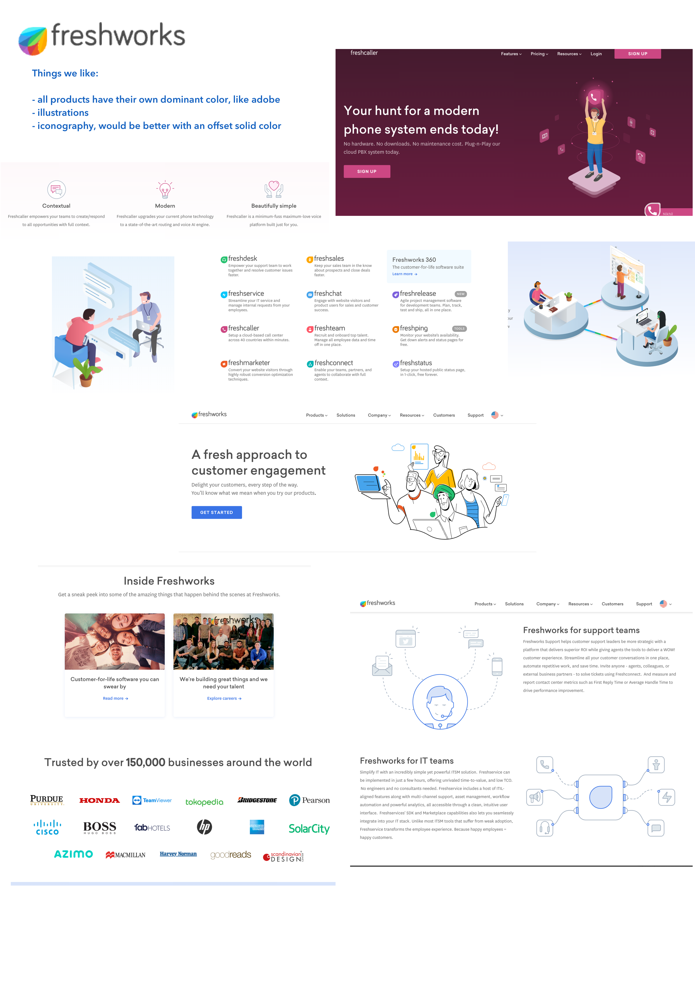
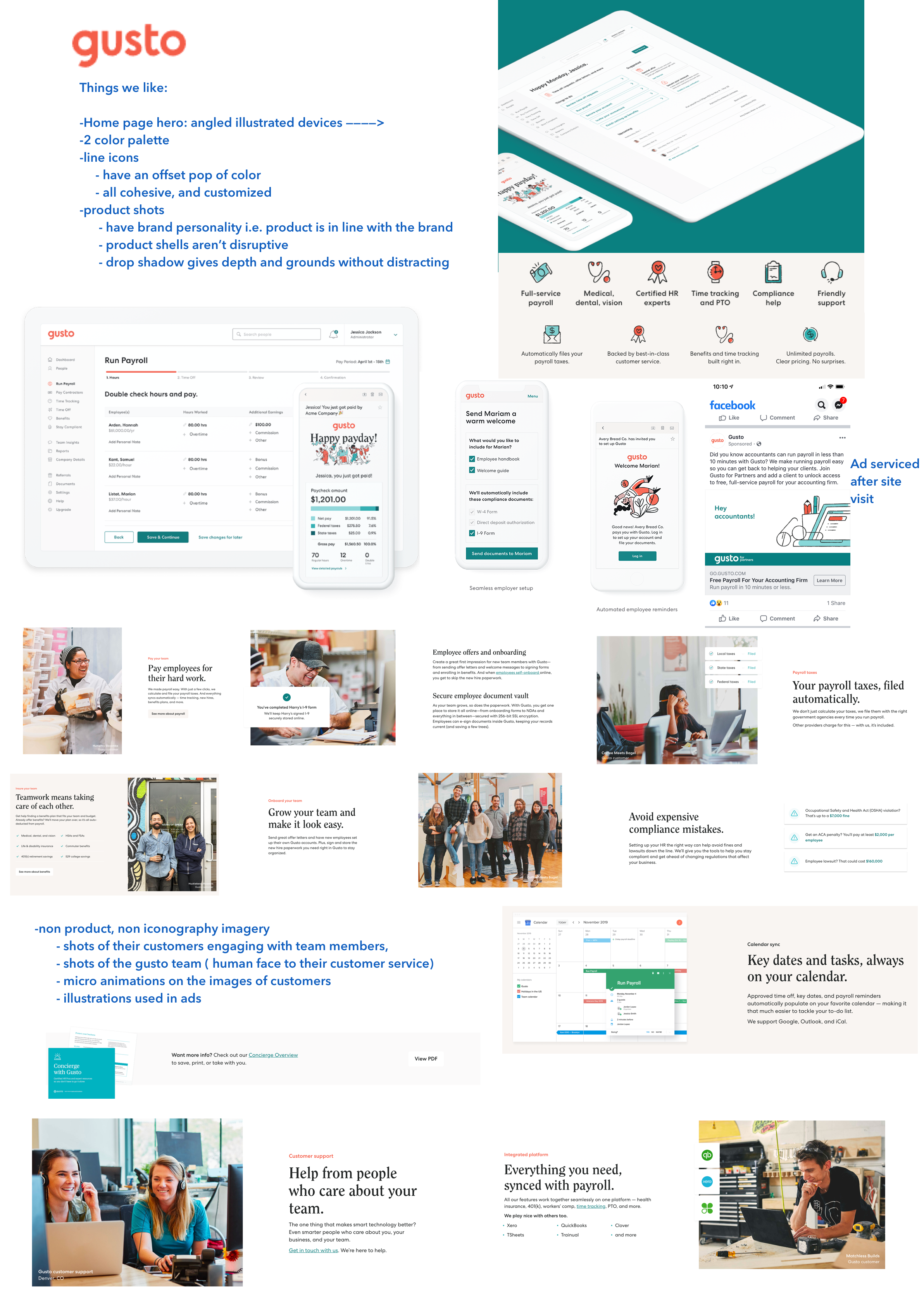
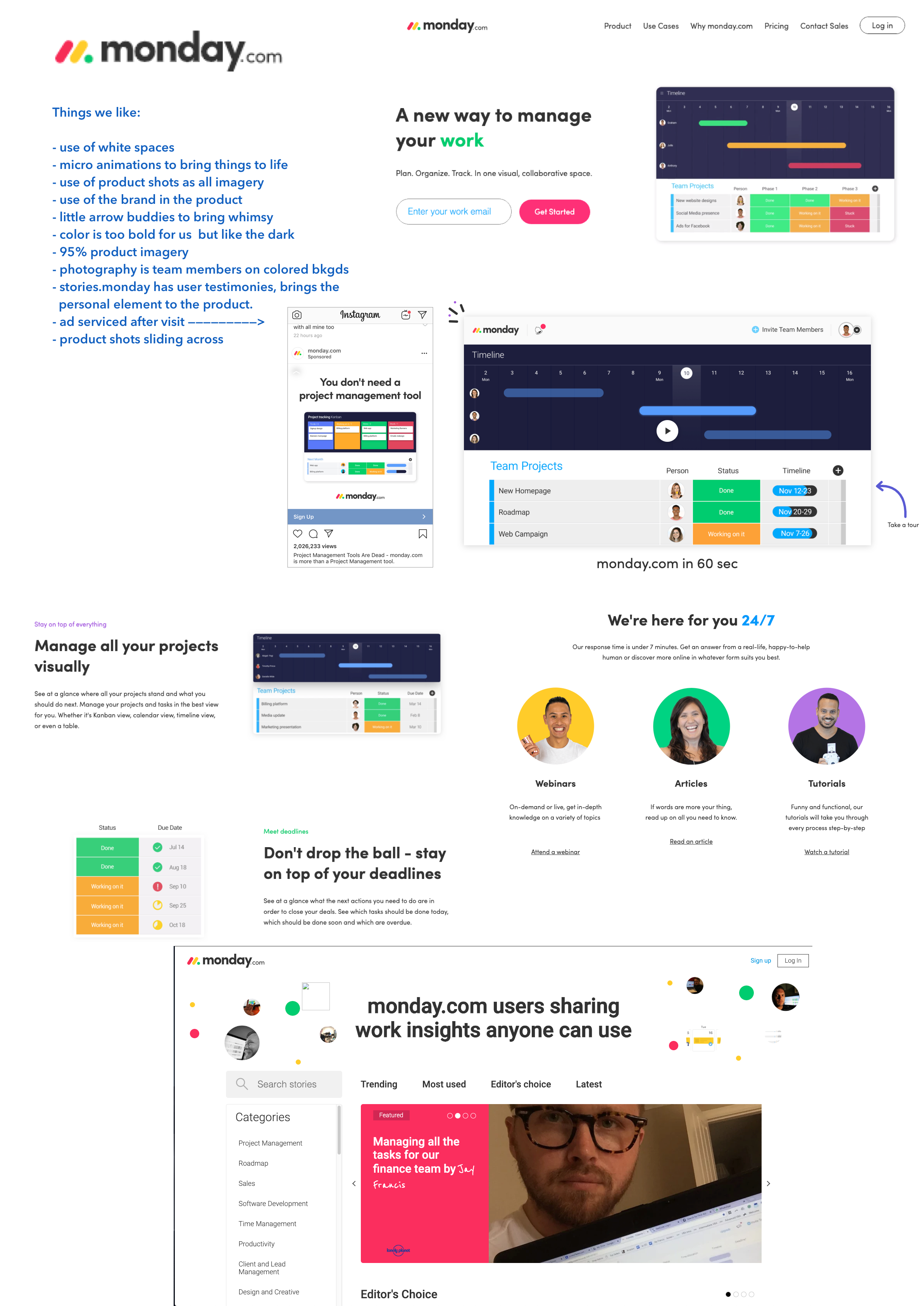
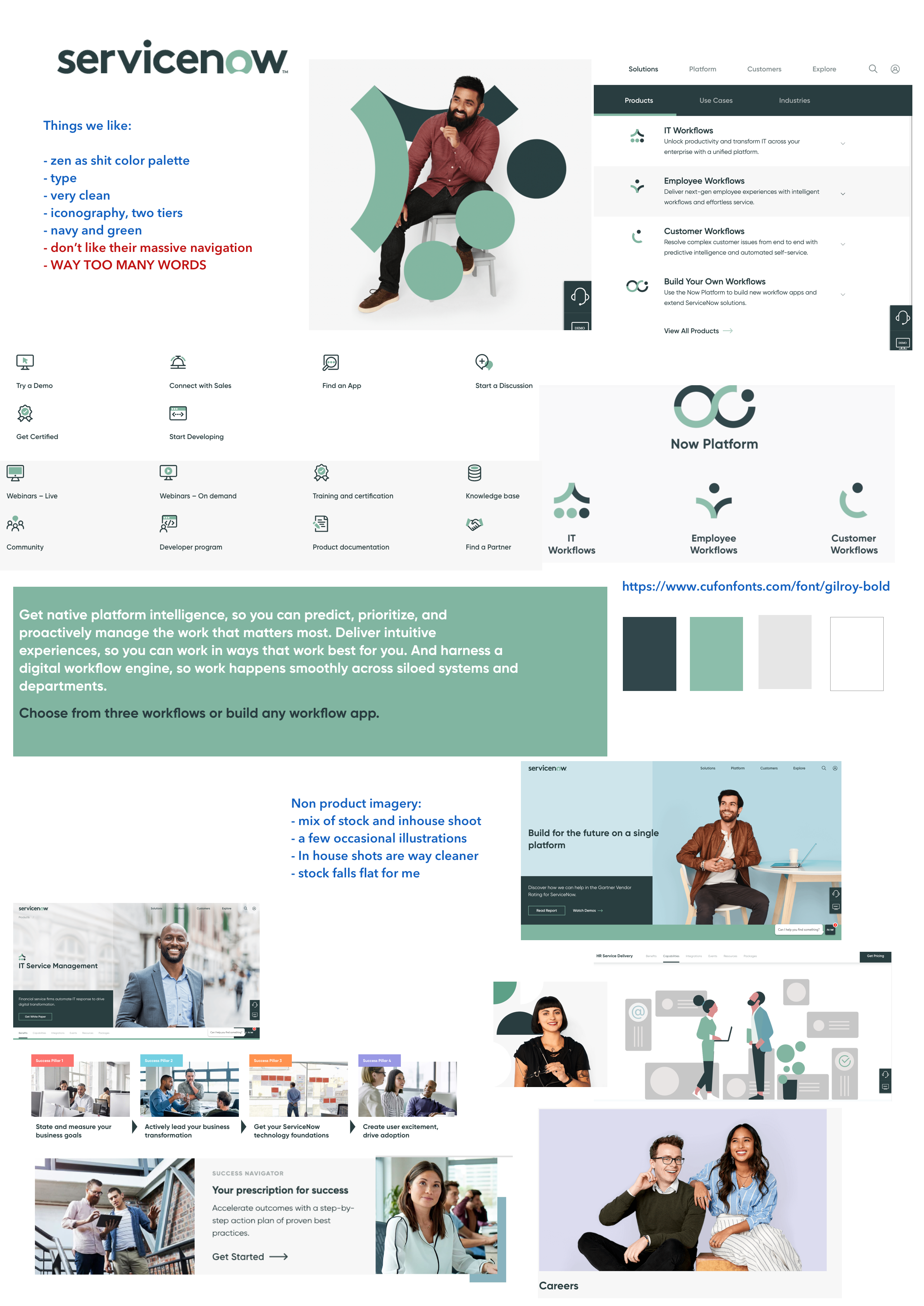
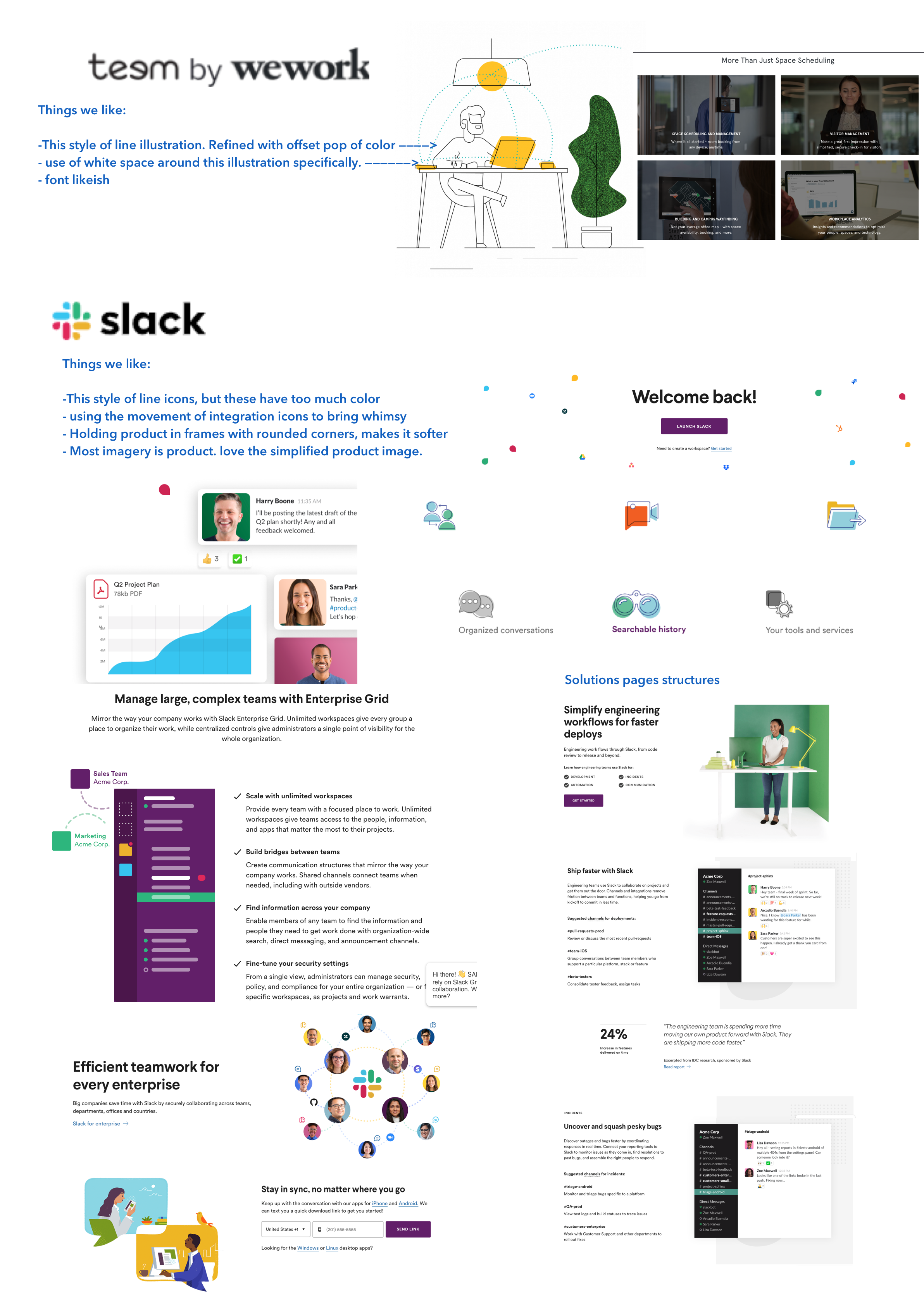
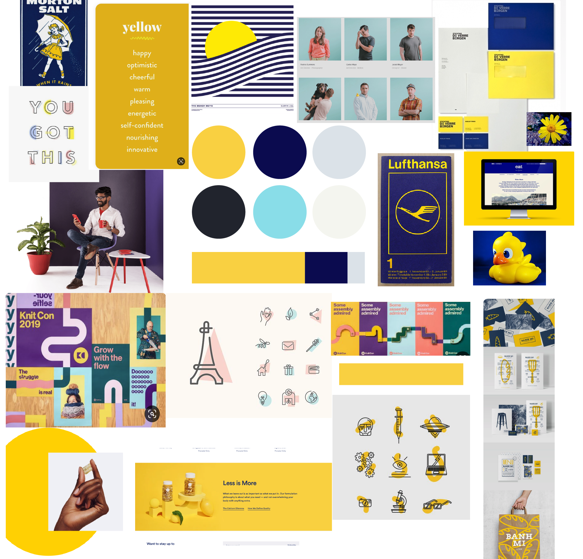
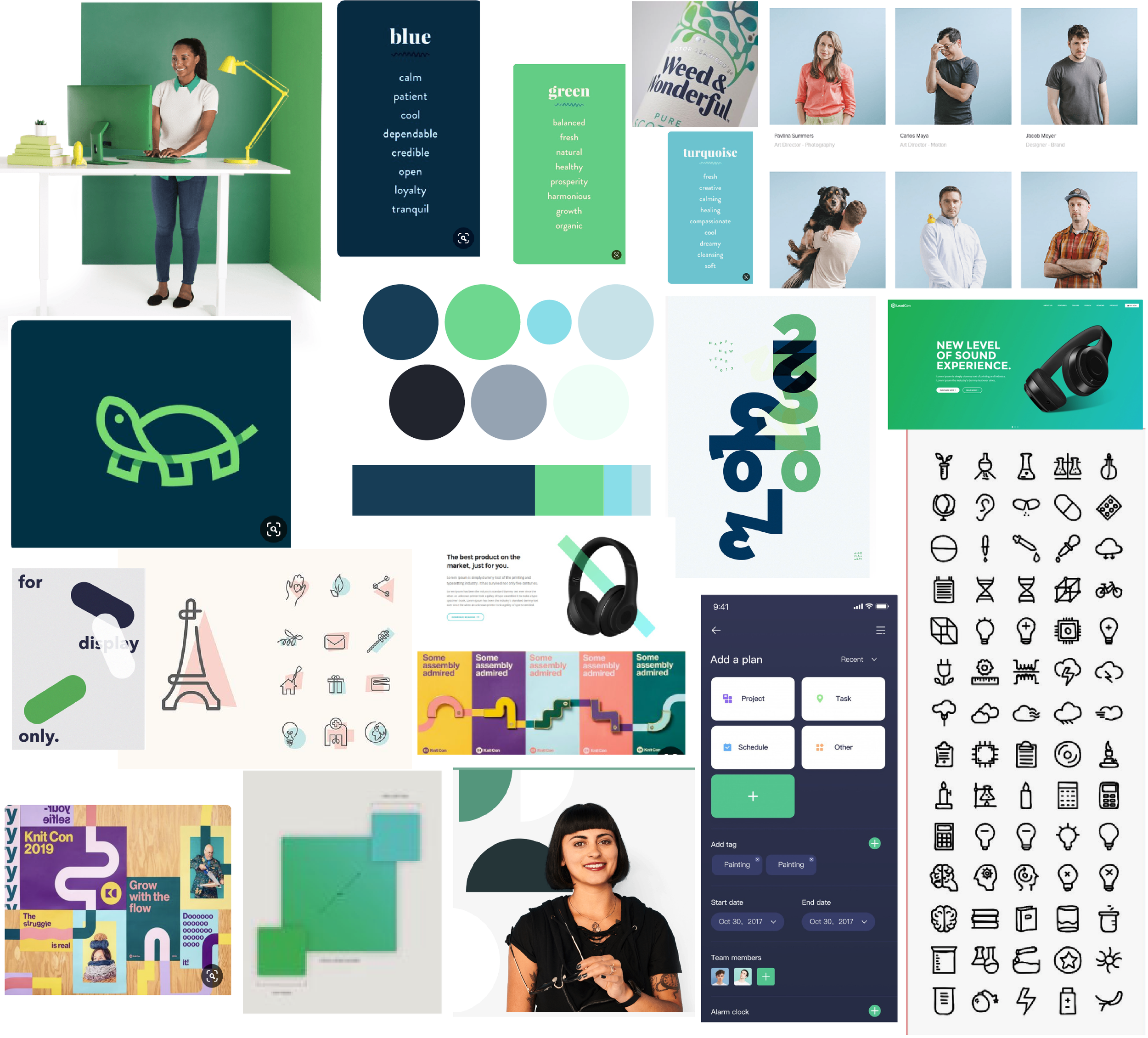
Like any brand project, our team started by talking with the major stakeholders. We wanted to know not only how they described our business but who they believed to be our competitors. After many conversations and white boarding, we started talking about what brands we like and think emulate what we want or showcase similar products. I love a bit of research and putting together a visual breakdown for the C-Suite to look at and markup.


Foundational Items

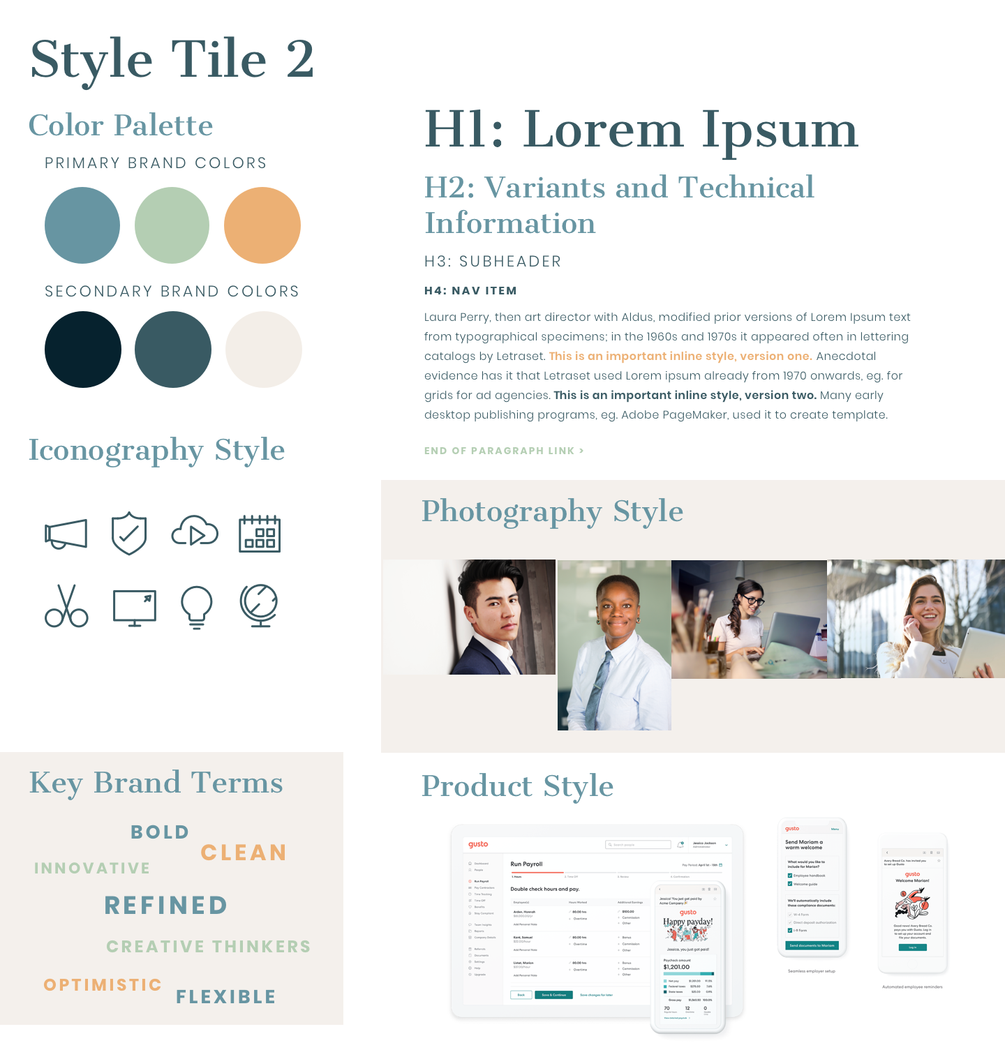
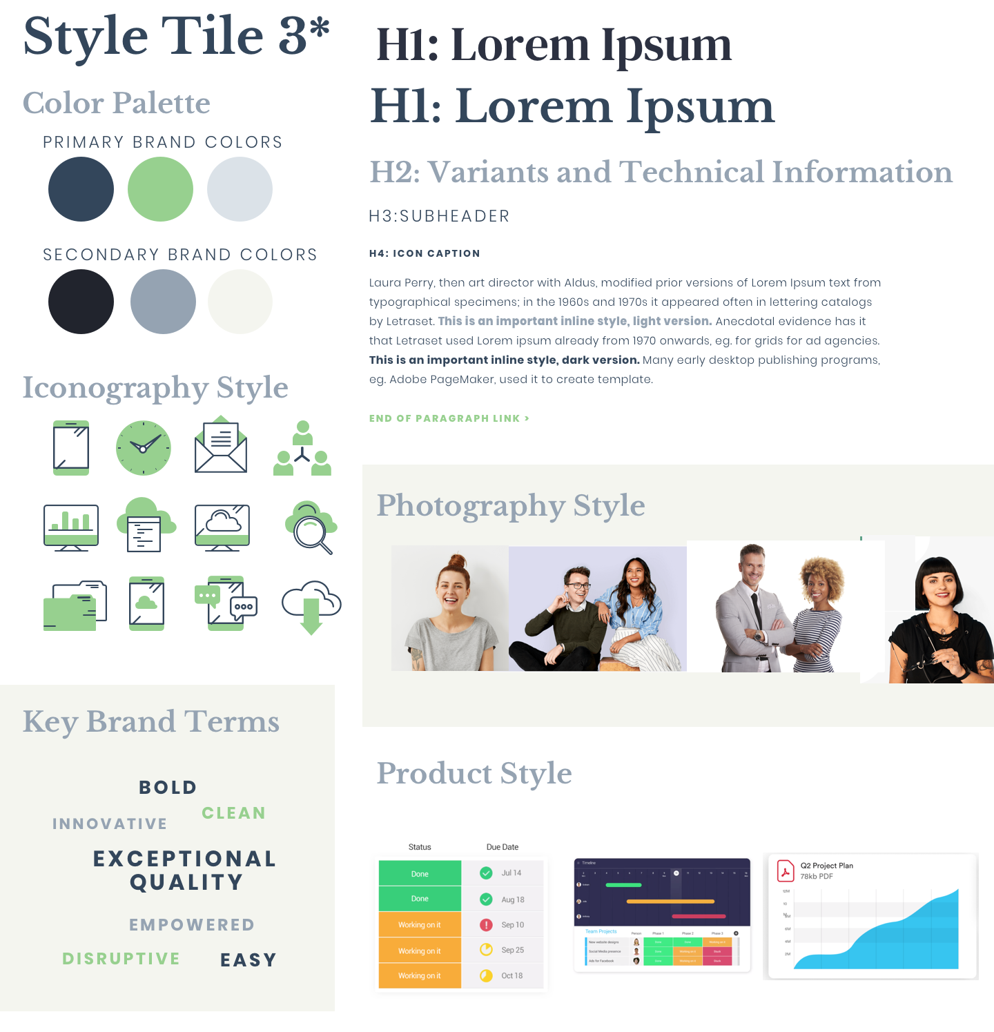
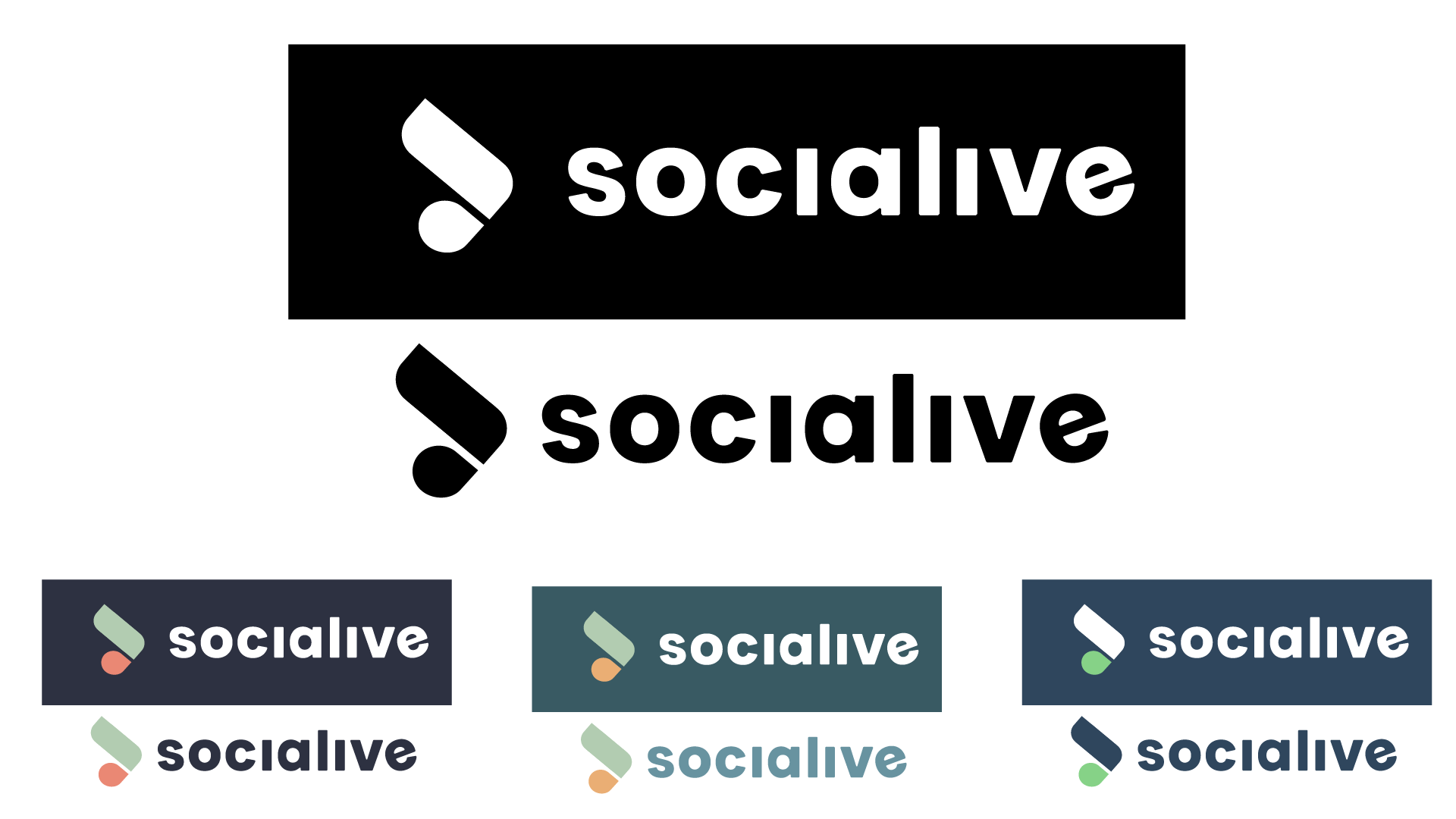
While our content marketing manager was focused on crafting the perfect language for our brand positioning, I was focused on the visual aspects. After hearing what the C Suite imagines when they think of Socialive, I put together a couple of style tiles and mood boards to start to hone in on the new Socialive brand.
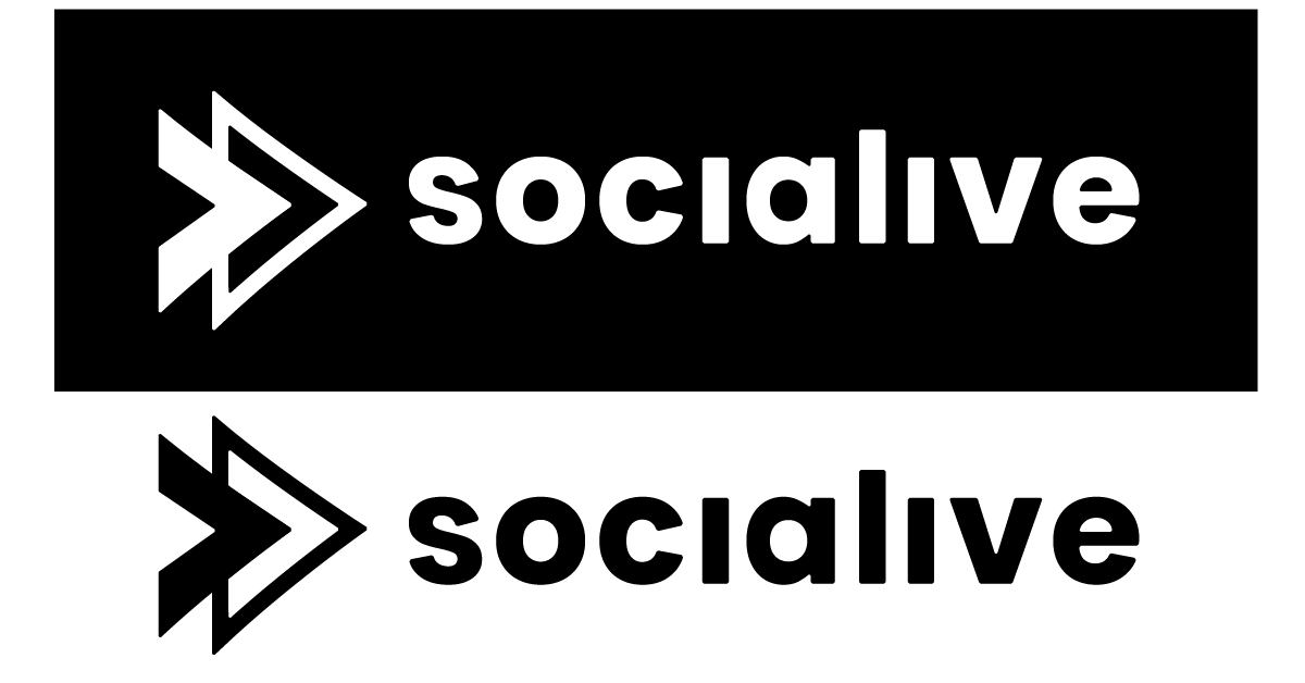
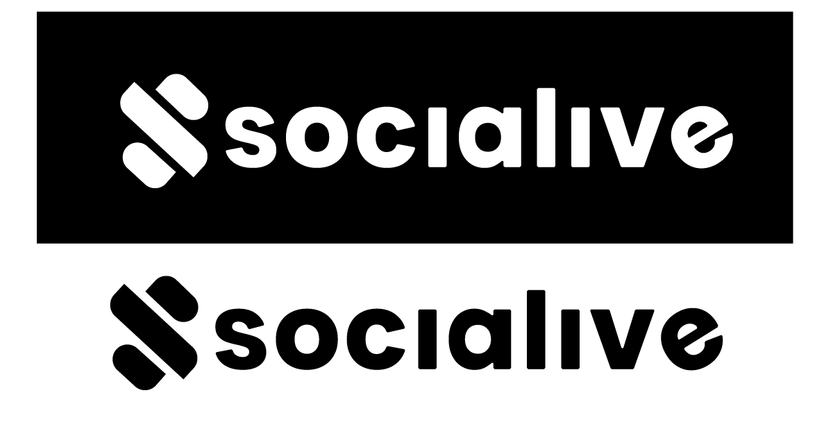
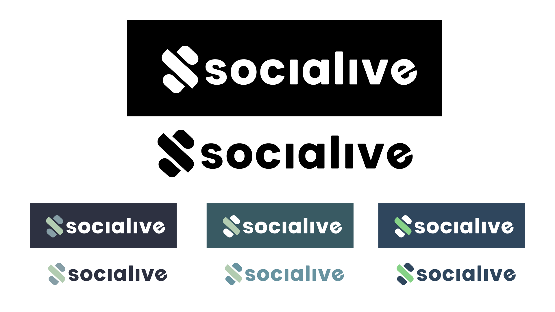
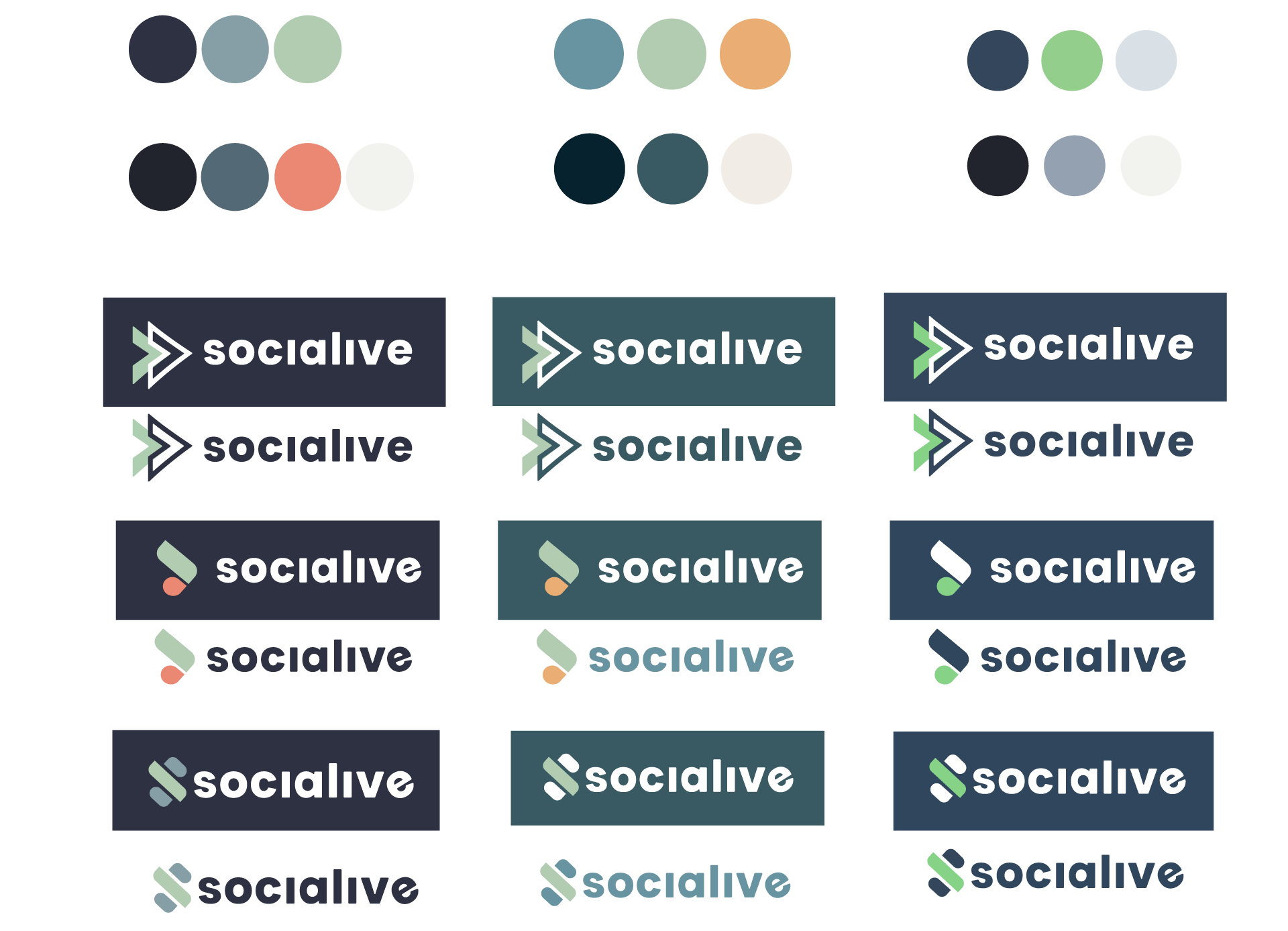
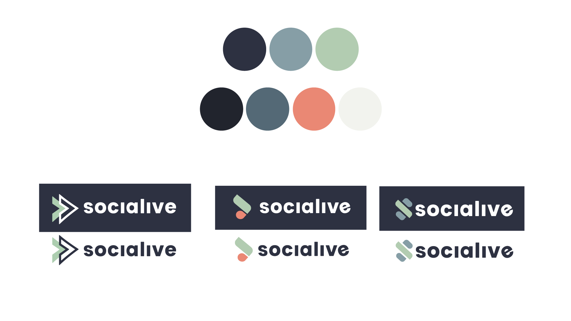
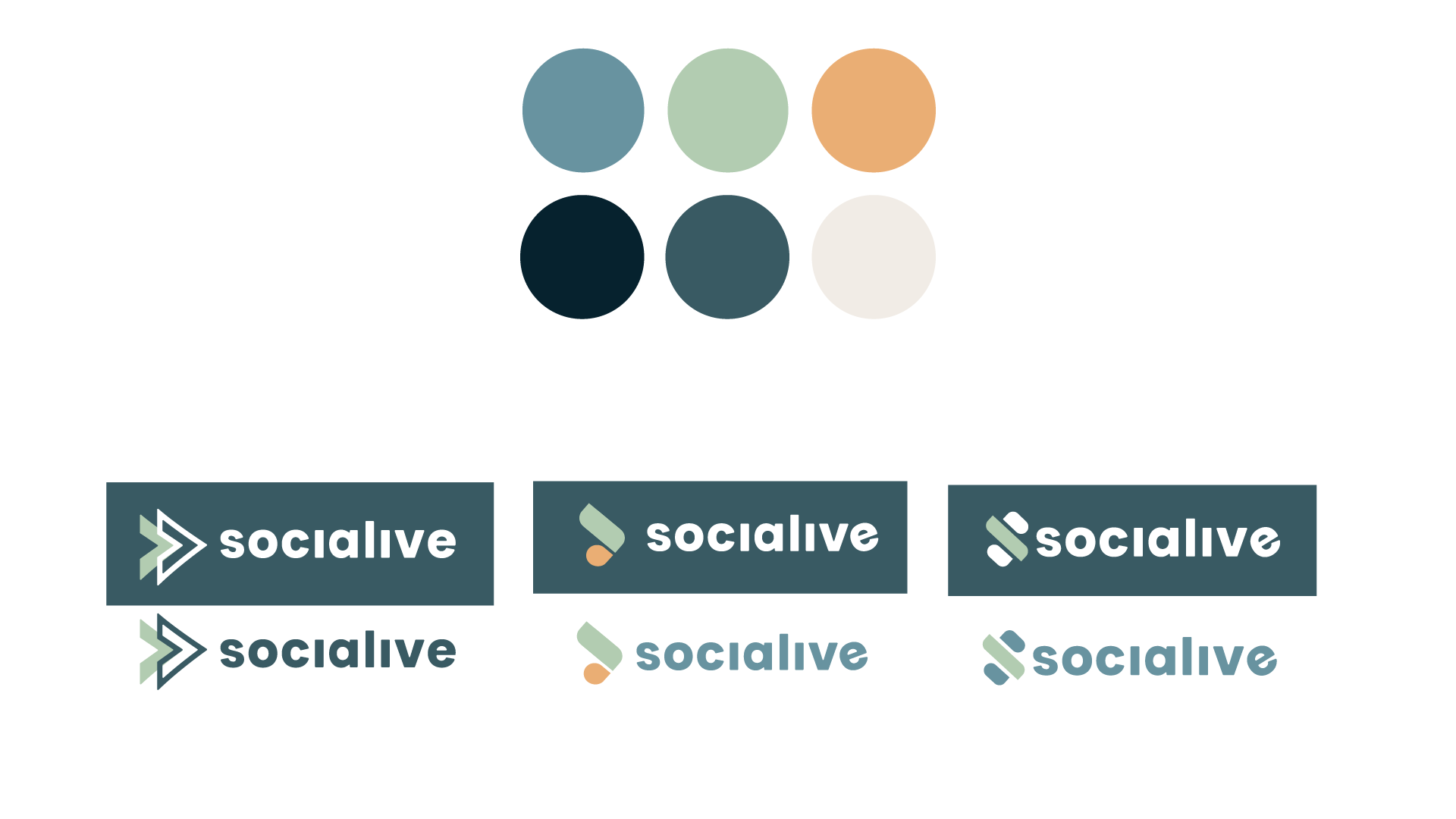
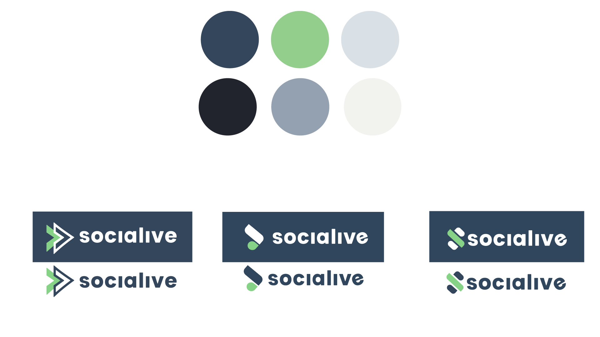
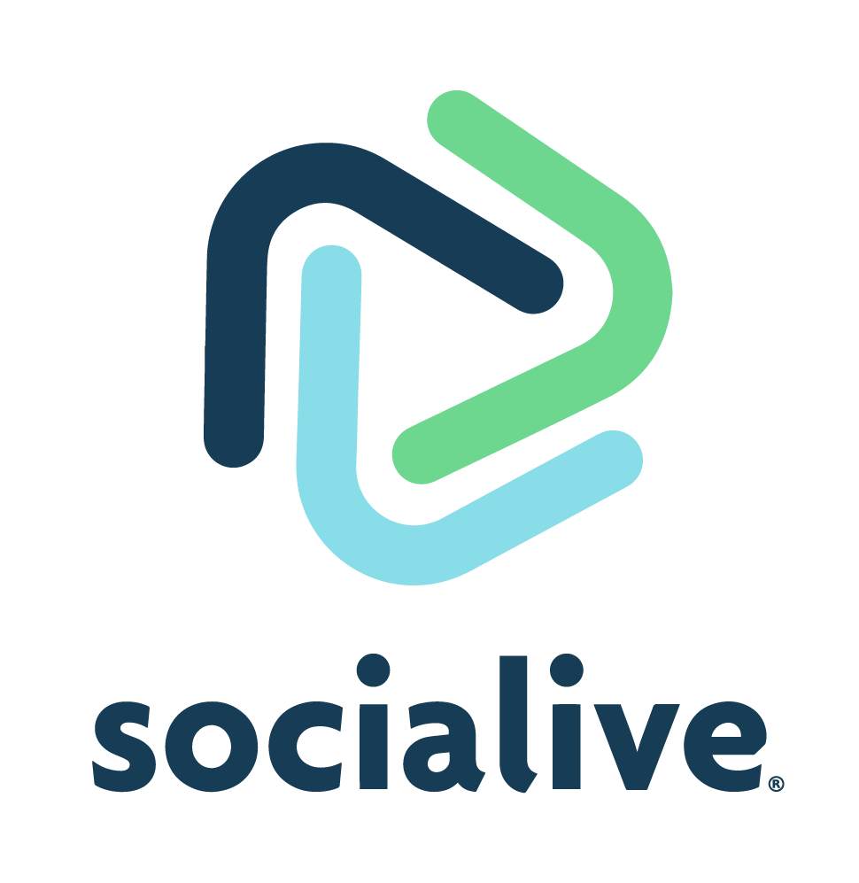
 

Deep in the trenches

Hundreds of sketches

Ask anyone who has ever suggested a rebrand, they’ll tell you it’s usually around the time of logo selection that everyone starts questioning their sanity. We went through hundreds of sketches and put together a small selection for C Suite to give feedback on.


After running through a bunch of options, none of the logos were quite working. So I went back to drawing board (almost literally, it was a sketch book). Using the color palette that the C-Suite loved, we presented these three selections.

Now that we had the core aspects chosen, we had to put it together in a concise usable form for our team. Below you’ll find a simplified version of the Style Guide.


The style guide

Logo


Color Palette

Primary Color Palette

Secondary Color Palette

Tertiary Color Palette


Iconography

One of my favorite parts of this brand was the iconography library that I developed. The custom line drawings added a touch of playfulness and whimsy, something that was incredibly important to not only the brand team but to all the stakeholders. When it comes to building a brand for a SaaS company, it’s important to add a human touch like this to make something complicated a little less serious and daunting. We used these to simplify concepts like demand generation, partnership opportunities, remote video production, and field communications.

Device Style


The Application

When it comes to rolling out a brand for a Software-as-a-Service (SaaS) company, there a couple of things to keep in mind. For starters, everything has to change essentially overnight. You can’t have your website with new branding and your platform with old branding. There needs to be a total change on socials as well as posts to signify the change. Your sales team has to switch over to new messaging, and legal has to have all new templates for any ongoing deals. It’s no small task and requires incredible amounts of communication and planning.